Wednesday 18 November 2015

Movie Me Reflective Statement


I was assigned to design and develop a movie that featured us as a main cast. The design process would involve creating a movie poster, ticket and wallet that would showcase the development of the movie design created. After researching several movie genres and existing movie poster designs, I started brainstorming my own ideas for a movie and decided that my chosen movie genre that I would work on a Coming of Age/Animation movie that would feature both Live Action and Animation, as development continued a decision was made that I would change my original idea and simplify the design and only focus on a Coming of Age genre that would strip away the animation side.

For this project I originally wanted to create a movie poster that took inspiration from Coming of Age and Studio Ghibli movie posters. It would feature myself as an artist that is trying to escape his life through a piece of art that he is struggling to finish, it would combine live imagery with illustrations that would represent the other world. As I progressed with developing my concept the idea of having the illustration separated into individual pieces of paper was conceptualised to emphasise the tone and important theme of the movie to the audience, this would coincide with the use of color where bright colors would be used for the illustration that would contrast the saturated tone of the live imagery. With the direction of the poster decided I started brainstorming ideas for the ticket and wallet design that would work well with the poster design, the idea of having the wallet as a book with the ticket came about, I wanted to choose something that didn’t feature on the poster but would have a key appearance in the actual film, as a result the viewer wouldn’t fully understand the connection until they saw the movie. With the ticket I wanted it to have a closer connection to the poster so the idea of having the ticket cut up so that the ticket holder would have to piece it together as it would represent the connection to the main character trying to finish the art piece, although this would not be a conventional product I felt that it was taking a more creative direction which was a goal I had set this year to take more risks with my ideas.

With my ideas sorted I started working on the poster design but as development progressed the decision was made to start over as I communicating my movie was difficult and with time running out I needed to simplify it by taking away the Animation element and creating a purposely rough design taking inspiration from movies such as Napoleon Dynamite and Diary of a Wimpy Kid. Using all of my development materials/ideas I proceed to come up with my final design of DRAMATIC TALES which would follow the minds of a man child, by using scans of materials and roughly cutting them out for the design it gave a feel of authenticity as it represents scribbles that people do on paper.

For the ticket I took the initial idea and changed it where the audience would make it themselves, the ticket itself would be a blank sheet with important features such as the title, VIP and information and a barcode but other material that featured on the posters would be provided to use as pleased. The idea came from the poster as people create things differently and the idea of creating something that doesn’t have to be pretty so giving the audience freedom was a way for them to connect with the character of the movie. The idea of the book was still used but changing it to a cheap notepad suited the theme compared to the initial idea of an art book and continued with the idea of giving the user a product that they can interact with and make use of even after watching the film.

Overall I am conflicted with my final product as there are parts that I like such as the ticket but the design itself that set the stage for the rest of the mock-ups is very different from my usual style so I find it hard to tell whether I have created something good even though it was purposely made to look rough for the theme of the movie I am unable to look past it, as a result though I had achieved a goal I had set at the start of the term which was to step out of my comfort zone when it came to my design style. I am happy that I was able to create products that cohesively go together continuing the theme and tone of the movie and chose a more creative route for the ticket and wallet by producing interactive products. I found that I was disappointed that I couldn’t follow with my initial idea as I lost a lot of time by starting over; I had a clear vision at the start of the project but had a hard time communicating it to others. I felt that the enjoyment of this project quickly declined when I made the switch and increasingly felt lost and it felt like I just ended up just creating something just to have something to submit rather than creating a piece that I would showcase but nearing the end after hearing user feedback it was clear that the audience instantly understood the direction my design was going for and the inspirations that influenced the design which lifted my feelings by the end of the project and I am happy with the collection of products that I have design.

If I was to do this project over I would have carried on with my original idea and visually communicate it rather than trying to explain it. I believe that I would have kept my momentum throughout the entire project instead of losing it. After completing this project I have come to realise that I am able to adjust to change but I also need to trust in my own direction even though other may not understand it initially I believe that I would have been able to communicate it in the end with the finish products.

Tuesday 3 November 2015

HP and Weight Watchers Logo - Analysis and Comparison

Logo designs are continuously evolving with the times. When observing the how companies develop there brand identity we see how the evolution of the logo can stay true the initial image and feel or stray away. Here we are going to explore two different companies and the evolution of their respective logos.

HP:

When HP originally created their logo it represented Hewlett and Packard, the two founders William Redington Hewlett and David Packard. This consists of a simplistic black color of the letters hp with a revolving circle. This developed into their next logo where the surnames of both founders are included into the logo while keeping the original logo shape by forming two halves of a rectangle, this was the first introduction to the color blue, I found that this evolution was a step in the wrong direction as it has to many things happening within the logo compared to it's predecessor which was more simplified and still represented the founders.
HP Original Logo (1954)
This later developed with their third iteration which took away the names and kept the rectangular shape, the lettering also met halfway between the first two designs and also made the color blue it's brand color. I found that this design works well by taking aspects from the older logos and combining them into cleaner design with a clearer message and tone.

HP Logo (1981-2009)
This logo lead to its current logo which simple inverts the entire design so the result is that the circle is the blue outer layer encasing the white HP. This logo is much more modern and fits with this time period of simplistic designs. I find this is a much improvement as the logo no longer takes as much space with the removal of the square. The inverted coloring also creates a unified design with the edges of the lettering not intruding the circular form. I found that this is a good example of how simple changes can vastly improve a design.

HP Logo (2009-Present)

Weight Watchers:

When Weight Watchers was created it was marketed as a weight loss company that was aimed towards the female market. The original design of the logo consists of the brand name colored in pink. The use of a scripted typeface and a slim weight of the stroke delivers the message of feeling slim and light, the logo feels inviting for a task that people like to avoid. The usage of color also instantly says which gender this is aim towards which is females. This logo works extremely well in symbolising Weight Watchers and their agendas while creating an inviting present.
Weight Watchers Original Logo (Pre-2003)

This logo later developed into one that was more aimed at the general public rather than a specific gender. The change of font suits the period of time while keeping its light weighted strokes but changing it into a more unisex program by changing to the color blue and using a San Serif font. The use of the swirls on the end also represents a feeling of health and movement as it includes the colors blue and yellow while wrapping around the first letter of the brand name. As the company broadened its target market they successfully developed a logo that no only looks appealing to all genders but keeps the intended message of losing weight and keeping slim. I find that this has a clear message in its choices of design while keeping with the times.

Weight Watchers Logo (2003-2012)
In 2012 Weight Watchers revealed its new modern logo which consists of a grayscaled design with large weighted font. The design of having the name fade from black to white does represent the message of losing weight and going from heavy to light but by taking away any form of color the tone of the logo loses any excitement and engagement towards the company which is suppose to be about being healthy and active. This negative decision isn't helped when you notice the choice of font they now incorporated, for a company about slimming down why would you develop a font that is not only intimidating but gives a image of a big bad corporation, this has also been compared to Microsoft Offices Word Art which is is not a positive comparison from a design aspect. The whole message and tone has been completely lost from where they began and that is why I feel that this development has resulted in a logo that completely loses everything that the past logos were trying to convey.

Weight Watchers Logo (2012-Present)

Sunday 1 November 2015

Studio Ghibli Theatrical Poster: Analysis and Comparison

Studio Ghibli is well known for creating some of the worlds most iconic anime featured films with a distinctive visual style and storytelling that is expressed in their film posters. When observing the range of Japanese theatrical film posters to each other, a similar formula is clearly seen and expressed through out the years.
When analysing the studios original Japanese artwork we see several of the following presented; the main character of the movie, the very bright or dark background and a subtle hint of wonder. There is a certain style to Studio Ghibli and to understand more we will examine specific details in some of there pieces.
Spirited Away:

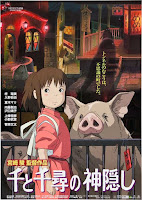
A darker tone is prominent in this Japanese version of the poster with our character being place in the foreground sharing the space with the imagery of the pigs behind a bar fence, this give the feeling of entrapment and the subtle hint that these pigs have a bigger meaning in the film and their connection with our character. The lightly lit town with haunting shadowy figures throughout gives the sense of a fantasy world which is under a dread.
When compared to it's American counterpart we see a completely different tone as we have our same main character in the foreground but without the inclusion of the pigs and we have a more friendly looking background with the use of a cleaner and more pleasingly lit buildings, even the shadowy figures are lighter and less intimidating. This changes the tone of a more haunting setting to something more innocent.

Comparing each poster the Japanese version holds true to the core of the movie while the American version has been changed to portray a more innocent story. We can see the different uses of imagery where the original uses the pigs as they do hold a big meaning in the film which shows that Studio Ghibli knows how to use the elements they have without giving away or changing the tone.


Japanese Theatrical Poster
American Theatrical Poster


Ponyo:
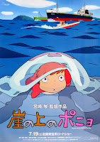
I bright fantasy tone is what is represented in the Japanese Theatrical Version of the poster, here we have our main character again in the foreground and our setting which is represented in our island and ship. The use of the imagery gives a sense that this is all set in a small island with a close community of people. The bright colors represent the feeling of the innocent and wondering character on the rock.

This cheerful done is changed when compared with the American version of the poster as we see a darker shades of color and the removal of the island and ships, instead we have out character floating in the water. By doing this the positive feeling is replace with suspense and the tone of the film while intensifying the fantasy element.

Comparing the two posters we get two different tones. The Japanese version focuses on a more everyday life with the fantasy slightly included while the American version focuses solely on the fantasy.
Comparing these two posters is difficult as they both represent two different kinds of movies in tone and in what the film could be about. We have our main character in two different situations that only connect with each other through our character and the use of water.


Japanese Theatrical Poster
American Theatrical Poster


Wayfinding in Auckland: Wynyard Quarter


"Wayfinding can be defined as spatial problem solving. It is knowing where you are in a building or an environment, knowing where your desired location is, and knowing how to get there from your present location." [Reference]

As part of this investigation we decided to look into the wayfindings utilised around the area of the viaduct, specifically Wynyard Quarter. We opted to start at the I-Site information centre on Quay Street. It seemed like a logical place that tourists or anyone needing information on directions would start. As soon as we reached the building I found my first problem with the use of wayfinding which can be seen in the following 'Image #1'.

Firstly the map is positioned on the entrance to the building which means if you're intending to view this you'd be blocking the entrance. However, that won't matter at all because as soon as you approach the doors to have a look it automatically opens, splitting the map into two halves! It's seems really ridiculous and essentially useless. The unfortunate thing is this position on the building of a centre that is supposed to specialise on communicating information and as soon as I walk past I'm already questioning there ability to do so effectively.

Image #1 - I Site - Quay Street
As we continued on down the eastern side of the viaduct it didn't take long for us to find a familiar wayfinder that most New Zealanders would probably be familiar with. This is one of the standard methods utilised by the council to show directions to popular locations (Image #2). The arrows are very clear on the directions while the text is legible and contrasting well against the dark blue. The one problem I have about this is the map, is that it was quite small and if I were intending to try pick out certain streets I would have a hard time. So I imagine if someone a little older were to try look into it, they're going to have even greater difficulty. However, as a whole the map isn't something essential as long as you have processed the information above.
Image #2 - Direction Column
As we followed the directions from our second wayfinder we stumbled across a commercial use of wayfinding that has gone wrong (Image #3). The store employs this double sided sign on wheels that they push out to the main street in order to draw business down the street and let the public know they're there. However, if you read the subtext of the sign it says "Past the Maritime Museum Entrance".  The problem the museum itself is located down the street by turning right, where as the sign itself was indicating you to go forward with it's gigantic, eye-catching arrow. If people are to follow the arrow which is the focal point of the design, they will be walking a while before they realise they're not going to get to the Canterbury Store. Luckily for them it isn't a permanent fixture and can be re positioned.
Image #3 - Canterbury Store
Ignoring the previous the sign, we turned right towards the Maritime Museum where we saw another directional column (Image #4). This column had a much different visual look, despite being a council sign. This was unfortunate as I was hoping to see consistency visually but the only thing that was similar was the rectangular shape of the column. While this column didn't have any arrows or anything to direct you forward I found that it's map was a lot larger/clearer and it had annotations pointing you directly to the common locations which i thought was helpful and would save the viewer a lot of time. Continuing just past the following sign we noticed a striking use of wayfinding this time on the ground surrounding. The colours and bold lines/font instantly draw your intention into it. The text is clearly read and
the arrow easily deciphered.
Image #4
The last use of wayfinding we found was once we reached Wynyard Quarter (Image #6). The design of this I thought was excellent for its intended purpose. It contained everything that I thought the directional columns should of had. The use of orange was extremely vibrant and I instantly looked at it and noticed what it was. The white contrasts extremely well making the text legible. The text itself is sans-serif, ensuring it's easy to read. Even the map itself has been designed in that it works well with the over look and most importantly it is large enough for you to be able to see not only where we are in regards to the map but also the adjacent streets.
Image #5 - Eastern Viaduct
Overall, while not only getting a bit of much needed exercise we noticed an extensive and wide variety of wayfinders alongside the viaduct. However, not all of them were that effective and fulfilling their requirements.

Image #6


Saturday 17 October 2015

Typography Poster


Helvetica

Designer – Max Miedinger, assisted by Eduard Hoffmann
Category – Sans-serif
Classification – Neo-grotesque sans-serif
Foundry – Hass Type Foundy
Date released – 1957


Helvetica
Helvetica is a commonly used type face that was developed in 1957 by Swiss designer Max Miedinger with the assistance of Eduard Hoffman. Miedinger and Hoffmann designed a neutral typeface with high clarity with no real meaning in its form with the wide variety of uses in signage.

During this period, Hoffmann was the president of the Haas Type Foundry, while Miedinger was a graphic design freelancer, where the two had formerly worked together as Haas salesman and designers.

The sans-serif typeface is a neo-grotesque design that was based on the 19th century Akzidenz-Grotesk typeface originally released by the Berthold Type Foundry in 1896 which became one of the first sans-serif typefaces to be widely used. Developed by the Haas’sche Schrigtgiesserei (Hass Type Foundy) in Munchesnstien, Switzerland, it was mean to match the trend of and rebirth the interest in the turn-of-the-century grotesque typefaces with European graphic designers, which resulted in the release of Universe, created by Adrian Frutiger within the same year.

The influences of Helvetica includes Schelter-Grotesk and Haas’ Normal Grotesk which lead to the name of Neue Hass Grotesk which gained considerable attention on its release, this was adopted for widespread release. The name was changed to Helvetica (meaning Swiss in Latin) by the German parent company Stempel in 1960 as a mean of a more marketable name internationally. With intention of matching the success of Univers, Stempel redesigned the typeface into a larger family.

Helvetica has become one of the most used sans-serif typefaces, it is a common choice in commercial wordmarks for brands such as 3M, BMW, ECM, Mcdonalds, Motorola, Nestle, Panasonic, Skype, Target and Verizon. Apple also used Helvetica as the syste,m typeface of iOS used for their products.

In 2007 a feature-length film directed by Gary Hustwit was released that coincided with the 50th anniversary of the typeface.

Typeface Poster 1

Overall from my experience researching and using Helvetica for my studio project I now have a better understanding as to why Helvetica has become one of the most popular typefaces in history. The clarity and simplicity, the vertical and horizontal form of the strokes, the monotone weight of the lines, all culminate into a typeface that is both classic and modern that highly works in when viewed by the public eye, that is why I find that it fits perfectly with its current uses in advertising, signage and documents. It is clear and easy to read while also keeping a structured form that shows in design. Before applying this typeface to my posters I never thought anything of the font but with having a clearer understanding of its history and current uses in the public today I have more appreciation for Helvetica and what it has accomplished.


27th Alphabet Poster 1

When using the font in my posters the first thing that came to mind was the clean and structured form which I ended up focusing on with my first font poster but that resulted in a product that felt information heavy and cluttered, this resulted in a more minimalistic second attempt where I took away most of the information and played around with the font to add more of a playful vibe which I also took into account when choosing the image of the woman as I felt that it was playful but also elegant. The use of colours were chosen to feature an older style look and to add some depth to the design. As for the symbol poster If focused on a minimal design which featured negative space while having the 27th alphabet as the main point of view of the poster while also including a smaller section of information.


27th Alphabet Poster 2
Typeface Poster 2


Sunday 11 October 2015

Logo Symbolism


Playstation

When the Playstation brand was conceptualised in 1994 over three dozen logo concepts were presented for the final selection. The final logo which would become iconic in the gaming industry was created by Japanese designer Manabu Sakamoto who has also designed other logos for the company. The logo consists of four colors that were used to symbolise joy, passion and excellence. The logo consists of a font typeface that was designed specifically for the company.


This design has become one of the most iconic logos in the gaming industry; it is the logo that started the Playstation brand name. The choices of colours represent a hidden meaning which isn’t represented when viewed but after finding out the reason behind it supports the values its gaming console strives for. The logo conveys the name Playstation in short form, which the name PS has become a name its self for the future consoles that came after.


Walt Disney Pictures

The Company Walt Disney Pictures was founded by Walt and Roy Disney in 1923, it was not until 1985 when the first appearance of the Sleeping Beauty/Cinderella Castle which is iconic for the Disney theme parks was used as a logo for the company. The logo symbolizes a fairy tale world focused on providing quality entertainment to children.  Part of the Disney world’s identity as a message to have fun in a fairy tale atmosphere and over the year has maintained its exclusivity and success. Originally the logo featured the castle with a beam of light appearing behind it but over the years it has slowly developed, the first change was introduced in 2006 with the modification of the light into a shooting star, this can be symbolized as the iconic Tinkerbell or Blue Fairy.

Overall the reason why I chose to look into this logo is because it works well in representing the company‘s feeling and message, it is one of the examples why using iconic imagery associated the name can work so well when viewed and the slight modifications can add more meaning. It represents that magical feeling that comes with the Films they produce that is felt from audiences of all ages.


Burger King

First introduced in 1967 and mostly looks the same to this day. It incorporates two half buns with the brand name in the middle that acts as the fillings, the slight difference font size in the word King also enhances the visuals of the logo. The use of simple bright colors draws the attentions to the audience irrespective to age demographics. The swirl is there to encase the logo an unify the elements.

The overall I chose to look into this logo as I am a regular customer to this chain and normally chooses this over their competing brands. The logo feels vibrant and sparkles which is alluring to the audience. As this is a logo for a fast-food chain it works well in representing a positive feel of the company with the expectations of selling quality food, which is a reputation that fast-food chains commonly don’t get from the general public. The logos simplistic symbolism of the two half buns represent the message that this is a fast-food brand while using attractive colors and a swirl that showcases the entire logo is inviting.

Le Tour de France

Created in 2002 by designer Joel Guenoun this logo remains unchanged. It was introduced for race’s the 100th anniversary with a 100e underneath meaning 100th in French. The logo consists of name of the annual and vigorous biking competition, within the name its self it uses the letter R to represent a cyclist in racing position while using the O and the circle as the bike wheels, the letter U can also be interpreted as the bike seat. The use of yellow also signifies a sun as the event takes place in the day.
This logo stands out with its playful font that bursts out compared to other tradition typefaces and the use of symbolism within the slight colour and the design of the lettering to create the imagery of the cyclist help enforce the event behind the logo which can be recognised even with the French wording.


It is a simple logo that conveys the message and feeling of the event to the audience that this day is full of positive, joy while also showing that this is a competition with serious participants.


Apple

Created by Rob Janoff in 1977 this logo has become a symbol of knowledge. Many have taken this logo as a symbol of Adam and Eve as in the bible they are tempted by Satan to taste the forbidden fruit from the tree of knowledge, Eve gives in to temptation and takes a bite, with their first taste of knowledge they are aware they are naked and ashamed, the first bite represents the fall of man. The creator has claimed that he didn’t explicitly intend this meaning when he created the logo and that the inclusion of the bite was meant for scale so that people would understand that it was an apple and not a cherry. The apple is a symbol one of the oldest and most potent in Western Mythology. The use of the apple is a simple use of imagery that carries the weight of centuries of meaning, Apples use of the logo is powerful and their name and corresponding icon are known worldwide.

Apple has made a simple icon from its brand name which holds many meanings that can be interpreted in different ways, the symbolism of knowledge works very well with their products as it represents the use of their computers to obtain knowledge. By using something that has a long history of meaning makes it one of the more interesting and recognizable logos without using a more complicated icon.